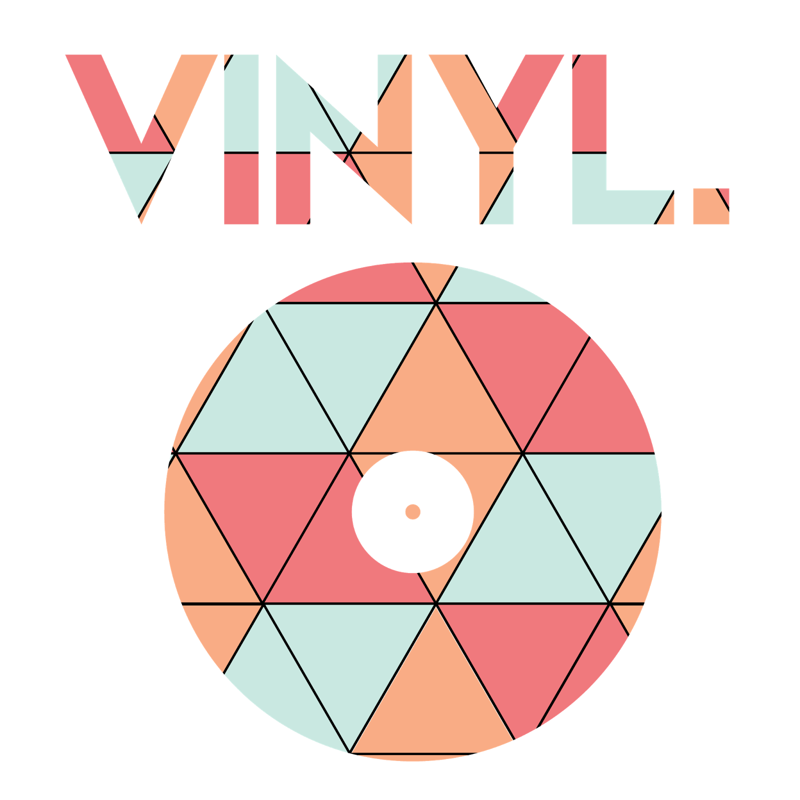
I started the
project with a clear vision of a journey, the journey from America to the UK of
the sport that is basketball; I looked at different advertising techniques of
basketball including English and American and looked into different graphic
artists that work for sporting brands such as NIKE and copied there styles to
gain an understanding of the software and eventually moved on to my own style
after a long experimental stage to find my own style, under the ‘vinyl’ logo as
it was ambiguous and allowed me to do whatever I wanted without boundaries to
have full exploration of the software and my imagination, whilst keeping
related themes however and eventually drawing the two paths together to create
a final piece from the skills I have learned through my journey from the
beginning of the project.
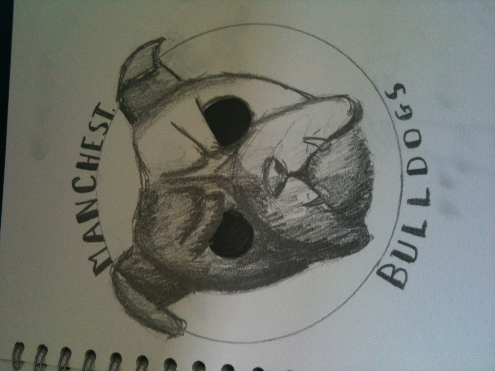
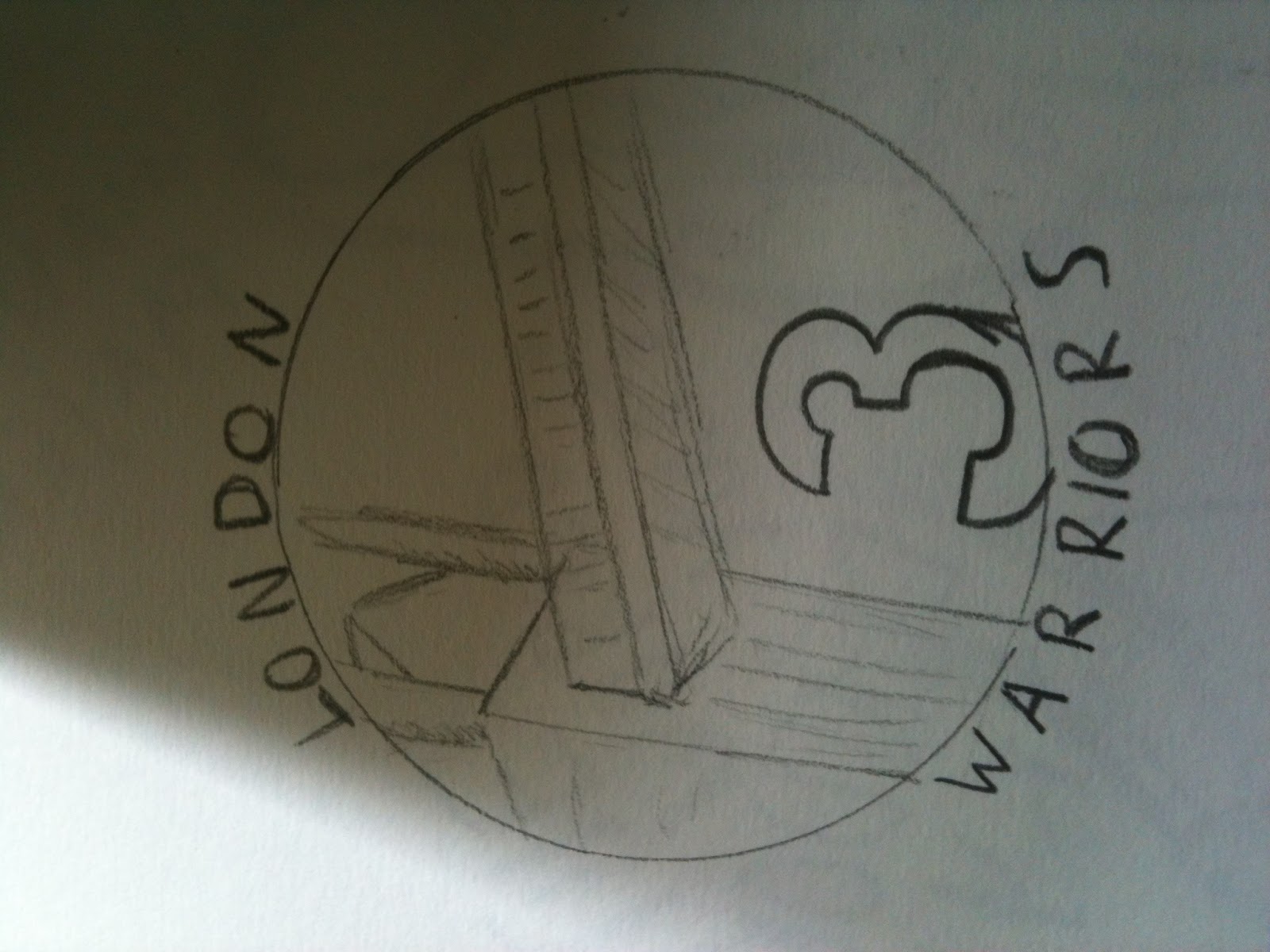
I first looked
into simple ad ideas from the NBA, and sketched up ideas, I quickly became
interested in the idea of ownership from the UK of the NBA and started
sketching up logos of Teams in British cities with new logos and names in NBA
style. I started to move onto the Computer to create the similar sleek logos of
the NBA, and started looking into Basketball graphic designers and how I could
create a style I wanted to create the logos with.


Sketch Up of Ideas


A look at different basketball advertising in the UK from a trip to london.
How music is used in basketball advertising.
 NBA ad draft featuring French player Tony Parker
I started on the
computer by using simple creation of portraits inspired by Naturel, an artist
from DC, these designs used geometric patterns to create a full portrait with a
‘3D’ look.
 Stephen Curry-NBA Point Guard
 Self Portrait
Sketch Up of Ideas
A look at different basketball advertising in the UK from a trip to london.
How music is used in basketball advertising.
Naturel
Naturel is a DC based graphic artist, he uses mosaic shapes to interlock as he creates images based around pop culture. This unique style and eye grabbing images using pop culture influence have caused him to explode online, and he has got deals with nike and sneaker head magazine to do multiple illustrations such as portraits of athletes or illustrations of their signature shoes.

Lebron James

Pharrell Williams

Wu-Tang Clan Logo
I like Naturel's simple style and how it creates new texture to images, i also like how he uses the same influences as me in basketball culture and rap/hip hop music.
I wanted more of a connection to my work however, and looked into
other graphic designers and found Razauno, who creates pop art inspired works
using bold lines and Hatching patterns along with repeating icons for shading.
I enjoyed these more as I was drawing the image by hand and felt like it
enabled more creativity and personalisation, I even created works on how I felt
when listening to different songs such as a funk inspired piece.
 A handgun inspired by Razauno's use of knives and weapons in his art
 Portrait of a Friend
 Kendrick Lamar-LA native, Lakers fan
The funk song that inspired my kendrick lamar portrait- Kendrick Lamar, King Kunta
Razauno


This led to the
creation of fully drawn images relating to the satanic image of rap music (a
large influence and influenced by basketball). I thoroughly enjoyed using a
gothic theme and tried to create more grotesque images, but was hindered by the
simplicity of the NBA.

Wu-Tang Clan logo to experiment with a new style, plus the incorporation of the Union Jack.
 Rappers I feel are portrayed as 'satanic' such as being said to be in the illuminati
Music Video that inspired the work-Earl Sweatshirt, Chum
I decided whilst
looking into graffiti artists such as neck face that I found other graffiti
culture was influence and had designs on clothing. So I started ‘Vinyl
Clothing’ a side project I could use to explore the idea I was moving towards
without restraint. I started with highly detailed yet cartoon portraits, first
of Nigel Farage, then of an eagle. I created a portrait of NBA player James
Harden to experiment with how these new styles were versatile and to keep
relations to my project.
 Nigel Farage as a satanic figure (because I really don't like him)
 Eagle
Eagle
 James Harden-NBA shooting Guard
Neck Face


Neck Face uses an extremely graphic and disturbing art style, I don't really know why I like it, I don't think anyone should like it to be honest, it's really weird. I used this grotesque imagary early on in my designs.

A panda kinda thing inspired by Neck Face.
 Loul Deng-NBA Small Forward
I designed this ad using my experimentation of free hand drawing, communication of a message and incorporation of text, the focus is on british NBA player Loul Deng, and is done in a media I had been experimenting with, and used a font that i felt matched the style. The message is that of the 3 teams in America he has played for, the only place he can call home is England. It's meant to show the british NBA fans that no matter how insignificant Britain seems to the NBA and vice versa, that actually it can be tremendously important.
When creating
these images I realized that text was an issue in my work and kept my work from
looking ‘one-pieced’ and rather looking like someone had stuck my brand name on
a different picture. From this I moved on to using patterns inside text to
relate to the image below creating unity between a logo and text.
 Vinyl logo inspired by Chance The Rapper


Vinyl-'pattern' collection

Then using
patterns I could look into colour and making multiple 90s themed Images of NBA
involved rappers using a ‘90s’ colour palette and pattern set I created could
create new styles. I also used wand drawn writing to keep the laid back feeling
of the 90s basketball culture.
 .
Pharrell Williams-Performed at the NBA all-star game
.
Pharrell Williams-Performed at the NBA all-star game
 Kanye West-Chicago Bulls fan
 Schoolboy Q-LA Lakers fan
I was looking at things like this when I created these pictures:

Wu-Tang Clan logo to experiment with a new style, plus the incorporation of the Union Jack.
Now with the full
knowledge of how I can use font, colour palettes and the different tools in
Adobe Illustrator, I started to design NBA logo inspired works for the ‘Vinyl’
label.


Logos designed from inspiration of the slick clean NBA logos such as:


Looking At Fonts in advertising at the Design Museum


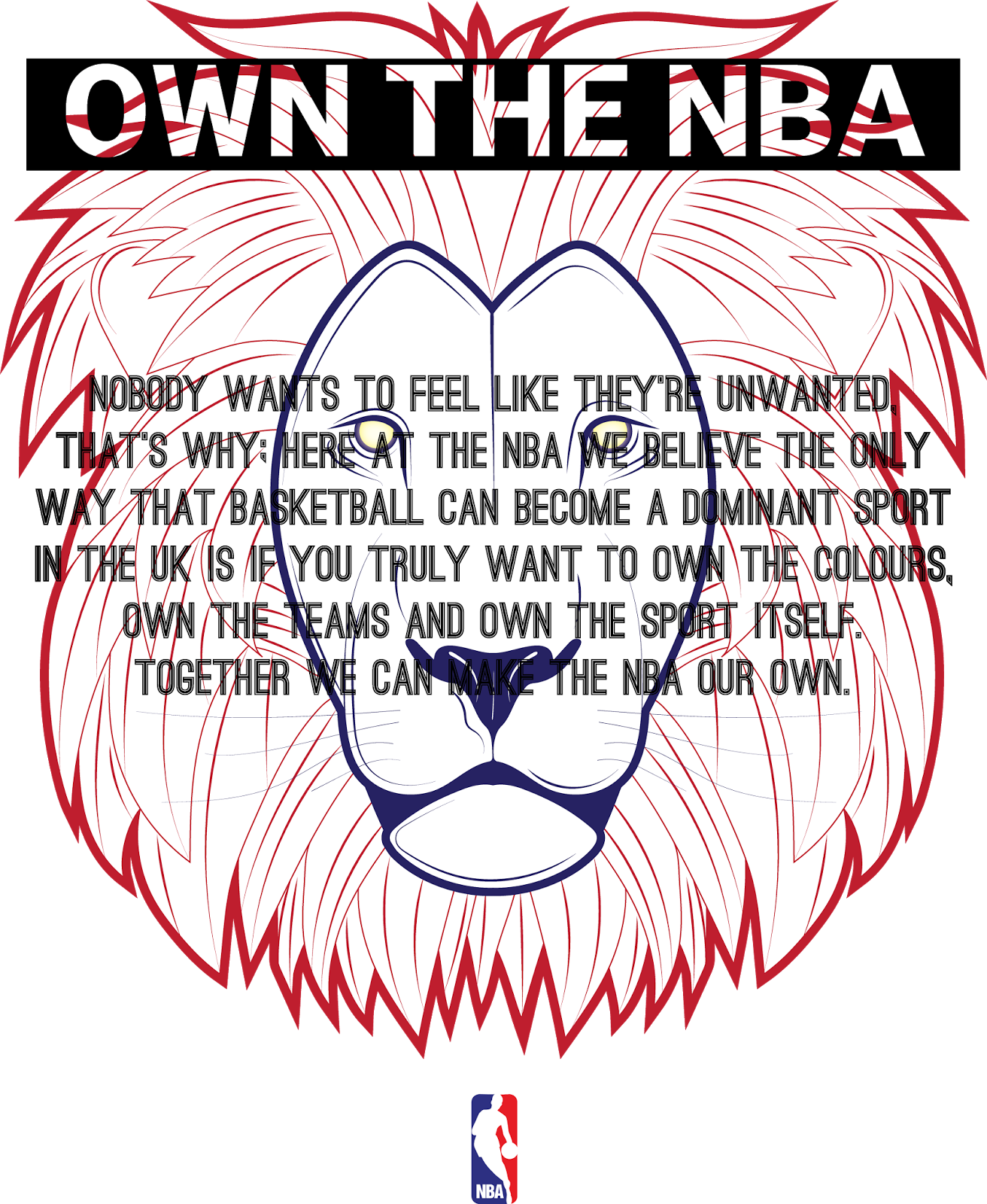
After feeling
confident enough, I created my idea for the exhibition of 8 NBA logos with new
UK colour schemes inspired by the Team GB advertisements and with new slogans
to replace the team name in the same font design, hand drawn. And finally a
piece explaining the ad campaign and how I want the audience to ‘own’ the NBA
and embrace it as a new UK sport, with my Lion design sitting in the middle to
show that the heart of the project is Britain itself.


Inspiration behind these:


No comments:
Post a Comment